
How identifying problems early in the design process fuelled a 40% uplift in loan originations
Executive Summary
In October 2025 I was seconded to the Acquisition Product Design team within NewDay to focus solely on our personal loan product. The main objective during my secondment was to get our product onto price comparison websites, also known as aggregators, and to launch this product before the new financial year beginning April 2026. This case study will cover: what our product is and what it means for the business; how I identified our core obstacles to launch; how I informed the working group that a strategic project pivot was needed; and ultimately how I enabled the product to be delivered and launched well within our estimated timeframe.

Enabled a strategic pivot to help move the team toward a better outcome
The initial requirement was to authenticate each and every customer coming into our journey from a Price Comparison Website. With deep dives into the current journey performance it was clear that placing customers into an authentication journey could stifle future performance. These insights has helped moved the projects towards a more seamless and highly converting journey.

Validation and testing in Discovery has proved invaluable
By testing and validating assumptions at an early stage of Discovery, we were able to define what the problem space actually represented which in turn has helped define a better solution for our client. Validating assumptions is a crucial step in fostering a unified stance on the problem space.

Drive cross-functional alignment between teams
By breaking the traditional silos of teams working by themselves and only engaging others in final stages we were able to bring together teams from various areas of the business to shape problems and define solutions which has ultimately reduced our time to launch.
An introduction to the project
What is our personal loan product and what does it mean for NewDay?
Our initial personal loan product launched to eligible D2C customers back in December 2022 as a solution to help ease the cost of living in the fallout of the now infamous Liz Truss September 2022 mini-budget which saw great market turmoil in the UK. Customers could take out a personal loan ranging from £1,000 to £7,500 and pay it back over 1 to 5 years.
Fast-forward to 2025 and our personal loan product is contributing a strong amount to NewDay’s bottom line. At the beginning of my secondment we were acquiring £7M per month from personal loan originations, however, this represents only 2% of the total amount of personal loans our eligible customers take out a month. This is a strong performance when you look at that figure by itself, however, when you compare it to the total amount of personal loans our eligible customers take out a month, which stands at £400M, that figure is dwarfed in comparison. This gap represents a great opportunity for our personal loan product to grow and expand into this market, which is where price comparison websites come into play.
How do customers access our personal loan product?
At the time of writing, our personal loan product is only available to eligible customers via our servicing platforms or if they have opted into marketing comms then also via email marketing. On our servicing platforms, eligible customers can apply for the product either through the mobile app or the online account manager. In both of our servicing platforms, customers can access our product via a banner or dedicated menu tab which opens out to a web based journey.
2. The Problem
How do we know it is our customer who is applying for a loan and not a fraudster?
What was the problem we were trying to solve?
With our personal loan product only available for eligible customers through our existing servicing platforms, the business wanted to put it on price comparison websites but still only accessible for our eligible customers. The core problem that we needed to overcome was how do we know it is our customer who is applying for a loan and not a fraudster? The business had also attached an ambitious KPI of increasing loan origination by £2.3m a month incrementally. With the core problem identified, I really needed to dig into why that was a problem, what the current state of our personal loan journey was, and understand why if we didn’t correctly solve for it, it could put the project and company at risk.
As with any business, once a problem is identified by a team, solutions are often thrown about in meetings, calls and emails, and even more frequently without engaging with the correct teams. In the case of this project the core perceived problem was: not being able to identify who is a genuine customer and not a fraudster impersonating a genuine customer. The correct assumption and least risky solution (for the business) was to throw in a login journey at the start where the user would need to sign into their servicing account in order to access the personal loan journey.
3. Solving the problem
As a Product Designer, my gut was telling me the original solution would not convert efficiently
How do I prove that the initial solution would likely not convert?
In order to prove that forcing every customer to login would not convert, there were several discovery activities I needed to perform. These activities included: current user journey mapping with conversion metrics; hypothesis testing to understand how customers use price comparison websites; competitor analysis to understand best in class solutions; user journey options and my recommendations.
Current journey performance benchmarking
I needed to benchmark the current performance of PLUM to understand where the core problems and drop off points are. Working with our data analysis and quality assurance teams I was able to highlight the drop offs and conversion metrics at each step of the journey. The journey before any changes were made had a conversion rate of 4%. With the largest drop off point located between the mobile landing page and loan calculator screen which saw a 56% drop off rate. After plotting every single drop off point and their conversion rate alongside their corresponding journey screen, it was very obvious that our solution needed to place these customers as far into the journey to avoid the main drop off points. These were the key takeaways from the journey analysis.
High drop-off rates: We were seeing significant abandonment throughout the journey with only 4% of customer converting, which indicates friction points that need attention. There is a 14% drop off between contact details and checking eligibility which could indicate a suboptimal customer experience.
Aggregator journey considerations: Repeating questions and steps in the new PLUM journey would not only frustrate customers but would also undermine the efficiency of our design. By leveraging the data provided to us by aggregators we could streamline the experience and therefore reduce unnecessary steps.
Customer intention: The intention for a customer is likely to be different than if they were entering our journey from an aggregator. Customers coming from aggregators will have already decided whether a personal loan is right for them and therefore should be more likely to convert after entering out journey.
Where in the journey we place these aggregator customers will be crucial to our success.
Hypothesis testing
During the journey analysis I came up with a few hypotheses that I thought would help steer my discovery and to fundamentally understand how customers use aggregators. The first hypothesis I wanted to test was “If you are pre-approved for a loan, are you more likely to continue with your application if you have to login to your mobile app to continue”. As PLUM was only accessible via the mobile app this was an important hypothesis to understand. Leveraging a UX survey we saw that roughly half of the participants surveyed would not continue with their pre-approved loan application if they had to login to their mobile app to continue. This was really eye-opening as it highlighted how risky it would be for conversions if we pumped everyone to the mobile app to continue with their application.
The second hypothesis to test was “As a pre-approved customer, you are more likely to convert if you stay on the same platform throughout the personal loan application journey”. Again leveraging a UX study, I sought to understand how customers currently access aggregators. What I discovered was that 68% of participants accessed aggregators via the web, with the remainder either accessing via a dedicated mobile app or through deep-linking (e.g. via emails/social media). This informed me that the solution needed to cater for the majority of customers coming via the web and the current implementation of accessing PLUM via the mobile app would not work for these customers. There was also a 50/50 split between the types of devices (laptop/desktop vs mobile device) customers accessed aggregators, which neglecting one or the other in our solution would potentially restrict the funnel by 50%.
Competitive analysis
From here I wanted to build a picture around what the best in class solution offered to their customers and to understand where in their personal loans journey they place these potential customers. Of all the price comparison websites in the market, I looked at ClearScore and Experian which are the two main aggregators that PLUM will be launching with. From these two aggregators, I looked at personal loan providers: ZOPA (pre-approved); John Lewis Money (pre-approved and loans serviced by ZOPA); and Tesco Bank (non pre-approved).
The main thing that leapt out to me from the pre-approved loan providers, was that they placed users as far into their personal loan journey as possible. For Zopa and John Lewis Money, this meant the user was placed just before they needed to sign any legal agreements. In both cases, it got the user to the hard check quicker without any unnecessary steps or heavy lifting. However, in the case of Tesco Bank, where I wasn’t pre-approved, I was placed right at the beginning of their personal loan journey as if I was applying directly through them and hadn’t come via a price comparison website. If I was to carry on with this journey, I would had to complete all the income and expenditure forms again and to make matters worse, their journey had some fundamental UX issues so its safe to assume it probably isn’t converting as best it could. It is important to note that these competitors were analysed in an Open Market capacity meaning I was not originally a customer of these competitors before I began the personal loan application which allowed me to get personal loan quotes via a price comparison website. Listing out the core features and pitfalls of these competitors and then presenting them back to the stakeholders was instrumental in demonstrating what PLUM needed to do in order to compete with these loan providers on price comparison websites.
As part of this discovery phase, we had discovered a 3rd party tool which could run behind the scenes and would allow us to identify between genuine customers and impersonators. This essentially solved for the problem of how do we identify our customers. Leveraging this 3rd party tool meant we could place our customers as far along the journey as possible which in turn reduces any additional heavy lifting for a customer, thus improving the conversion rate.
4. Pitching back to the stakeholders
Presenting the findings back to the stakeholders
Once I had gathered these insights from my discovery phase, I needed to present them back to the stakeholders in order to ensure alignment, answer any questions, and most importantly to get stakeholder buy in. To ensure it landed right and the correct message was put across, I had created 3 user flow options along with estimates to show them that if we spent a little bit more time on building the right solution we would be better off in the long run than if we were to just ship the quickest solution.
User Flow 1 - Fastest to deliver
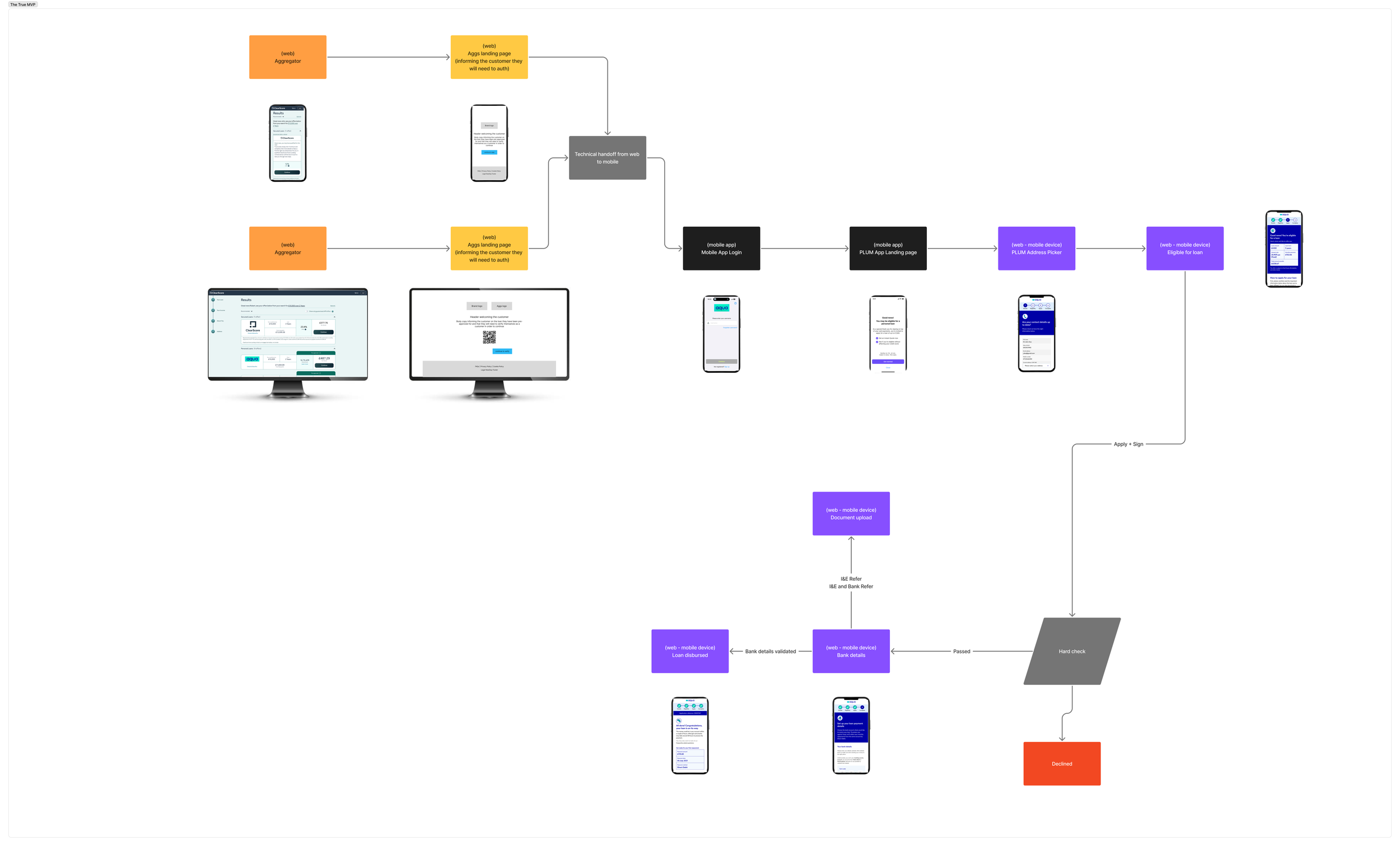
The core part of this user flow was that it could leverage the existing mobile login, which is very secure, as well as the mobile journey for our personal loan product. This would require only 2 additional screens to be designed and built to cater for this journey. However, the main drawback to this was based off the hypothesis testing, there could be a major drop off of customers coming from a desktop browsing experience and into a mobile journey. This would be even worse if it was coupled with certain customers not having the app already downloaded. We also had data to suggest that there could be a 40% drop off if customers had to scan a QR code to download the app.
User Flow 2 - Least customer friction
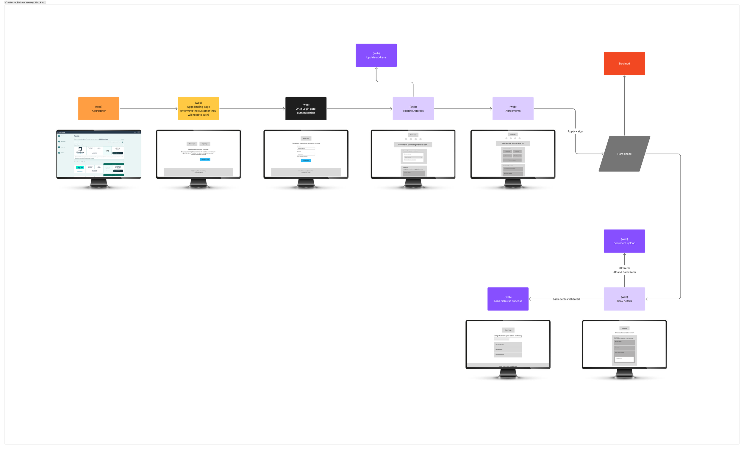
For user flow 2, I wanted to leverage the data from the hypothesis testing and recommend that we keep customers on the same platform that they started the personal loan application on. This would reduce the possibility of drop offs from switching between platforms. However, it still incorporates the login journey as this was the a requirement from our Risk and Legal teams. The core decision point, which hinders this user flow from a conversion perspective, is the customer needs to decide whether they want to login or not.
User Flow 3 - Least customer friction and enhanced authentication
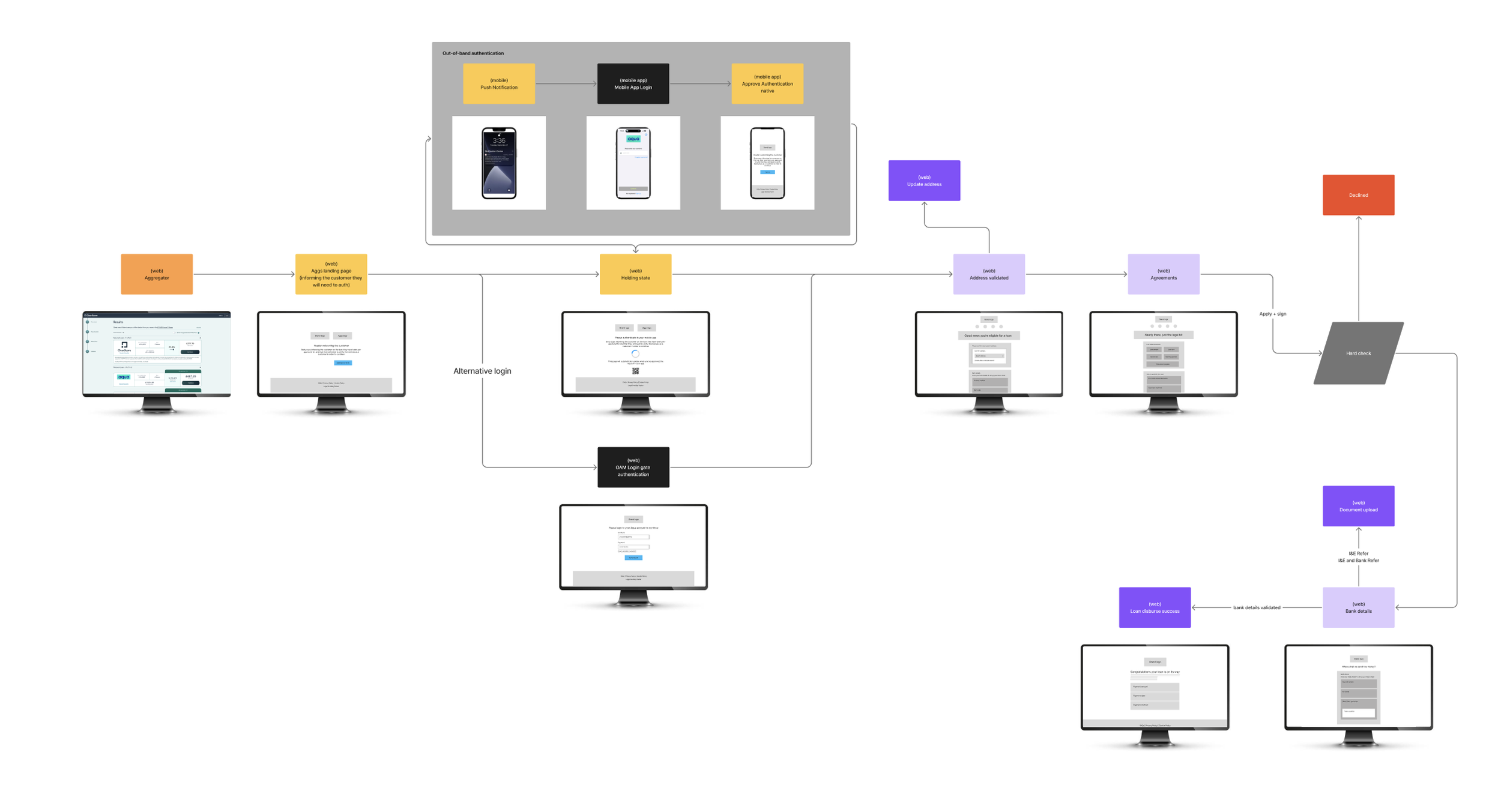
This user flow blended the strengths of user flows 1 and 2 into one. If a customer was coming from a desktop, they would be shown a message that told them to approve the login request on their mobile device. This is known as out-of-band authentication and makes use of a secondary device to authenticate someone. Although it was incredibly strong at the solving the problem of authenticating our customers, it didn’t mitigate the risk of a poor converting journey.
5. Bringing the team together to forge a better solution
By showcasing how frictional the journey would be with authentication the teams quickly realised that a login journey wouldn’t work for our customers and the business. During these playback sessions with the stakeholders it was decided that based on my discovery findings that none of these user flows would work and that the original requirement of authenticating each and every customer needed to be challenged. I proposed that we use the 3rd party tool that ran in the background to authenticate customers would be our best solution. We ran several sessions with our Risk and Legal teams to ensure the fraud risk was mitigated as much as possible.
Maintaining security through a seamless journey
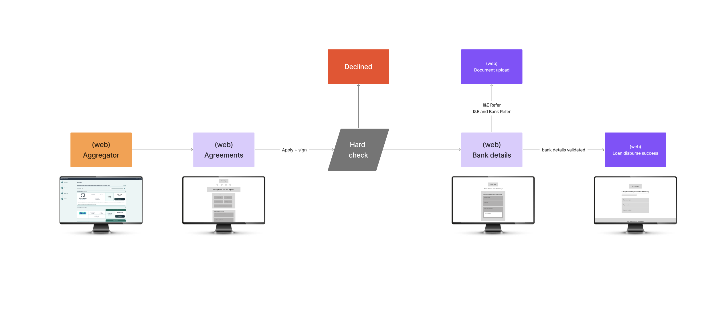
The new user flow with no login journey and leveraging this 3rd party tool we were able to place customers straight into the journey just before the hard check. Usability testing on this user flow proved it to be very successful in converting customers.